
MEE-FIT brand REALIGNMENT
CREATIVE DIRECTION / BRANDING / STRATEGY
Branding, design & strategy development for the gym MEE-FIT. I came on board at the very start of MEE-FIT’s journey & created all of the initial branding and we have just gone through a realignment piece to develop the brand further.
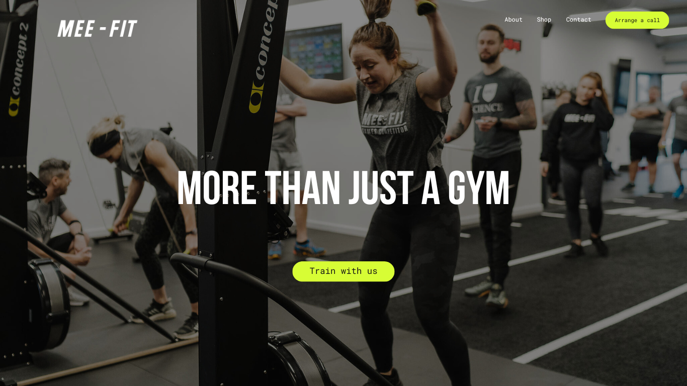
Website Design
Design for new website look & feel. Bringing in dynamic photography of the gym in action with brand logos & colour palette. The objective of the site is to give potential new customers an exciting overview of the gym & the services it offers.
Brand Values
-
Here at MEE-FIT we offer a plan to get you into a strong mindset to achieve your goals. Allowing you to become the halthiest, strongest version of you
-
Our passion is helping our members achieve the results they've always wanted and maintain them for life.
-
We offer unrivalled accountability and support
You're never left to figure it out on your own. Our team of coaches will guide and support every step of the way.
-
We are an inclusive & supportive community.
A fun and non-intimidating environment where the community support you receive is just as impactful as the trainers. More than just a gym,



Icon Creation
The icon was created for use across clothing & in any instances where the main logo is already in use. The arrow and hidden arrow created with the negative space represents the progression & statement of forward intention that someone makes when they sign up to MEE-FIT. As well as reinforcing the gym’s values of motivating people and helping them to be the best version of themselves.

Examples of the brand look & feel. Typography & colour palette usages as well as the way imagery can be graded for a cohesive visual direction

Social Strategy
Instagram stories and grid look & feel. Instagram and other social channels are often a new customers introduction to a brand so it’s vital that they are presented with a cohesive & clear representation of the brand.
Key messaging will also be utilised to tell current members stories, share their wins & create a welcoming & informative online presence for gym members.